Neglecting Accuracy
February 29th, 2024 | by Andreas Richter
(4 min read)
Humans are mapping the world for orientation. They try to put something three-dimensional on a small two-dimensional sheet of paper. We already had a short glimpse on how to map the world accurately. In addition to representing the world, maps in general also display possible ways of transport. Having a closer look at urban areas we know paper maps from the good old times and map applications in mobile devices from nowadays. Also, accurate aerial images are very helpful to get some orientation. But, while we are trying to improve accuracy of such maps, why are public transport maps often not spatially accurate and do not reproduce reality? They are boxy and do not resemble distances and locations in reality.
Mapping the world not always means to map it accurately. Next to geographical and navigation maps also topological maps exist out there:
- Most common are road network maps. Nowadays they differ between standard definition (SD) maps, representing roads as network with nodes and edges (where edges can follow the course of the road) and high definition (HD) maps, which include also lane-level details such as their topography. Additionally, maps can contain information about transport links, points of interests and – in their HD version – road topography for micro-routing.
- Road topography and beyond is part of cadastral maps. In general, they cover real estate information but they also model infrastructure assets. Both is used to manage road as well as rail topography by the corresponding operators.
- Road network maps may already be used for navigation (routing). Dedicated navigation maps include additional technical information for localization (e.g., maritime navigation data telling about the light pattern of the light houses). For automated driving, localization data can also be about the environment and its scenery elements. Classification of these objects and their features can support the perception of automated driving systems.
- Next to these kinds of maps there are also thematic maps. They are used to portray the geographic pattern of a theme in a geographic area. For example, they illustrate how agricultural crops are distributed through a country, or, where different types of industry are predominant. Socio-demographic data can be shown as well, such as population density, traffic demand, mobility accessibility and many more. To emphasize the differences of these themes between different countries, the size of a country is often scaled according to the topic, which makes the world look totally different.
Public transport is part of our daily mobility business and would fit quite well into the road and rail network maps. But for decades, public transport is mapped in a schematic way. The question is why, because it all started with geographically accurate representations of cities or countrysides while overlaying abstract individual lines of different public transport routes for easy identification.
At the end of the 19th century, positional accuracy began to be neglected in maps in favor of focusing on topology. One of the major drivers was the Brit Harry Beck. His famous work is the map of the London Underground. The idea was to increase readability and understandability by focusing only on the public transport itself. If stations are located close to each other, it is sometimes complicated to label all station names on the map in a readable way (especially, if you want to display different characters for different languages). Next, sometimes there is a lack of space for putting everything in the map. The transport vehicles have limited space to show the line or the whole network in their interior. The bus stop booths also have limited availability to put up big posters. The idea was to apply space-saving together with more clarity regarding the stations along the line. The solution was to schematize the maps, using only fixed angles such as 0, 45 and 90 degrees and straight lines. Sometimes, for iconic ring lines such as the Moscow metro ring, a circle was used.

Color grading was applied to distinguish between different lines and line style for different transport modes. Thickness of lines often resembles the headway of the public transport and sometimes the travel time between stations is added as well.
Also, the representation of stations was schematized especially for transit stations to better explain where you can switch from one line to another. The reason is that it is often unclear if different lines are using the same platforms, or, if different buildings are just connected by linkways. To add even more complexity, information about zone pricing was integrated, which added an additional level of complexity regarding schematic readability and efficient use of space. All of these design concepts lead to a public transport representation that is reflecting geographic reality only partly.
This very schematic representation was very popular for quite some time but now the trend goes back. Maybe this correlates with digital map applications getting used more commonly than before. They are showing the area in a topographical way because they often provide aerial images as well, fusing them with information from the topographical layer. Thus, on your mobile device, public transport lines follow the topographical flow. It gets complicated to translate this to schematic transport maps. To bring both closer together the schematic concepts get extended by adding a little bit of spatial accuracy such as distances of the stations and a more accurate course of the lines. The representation is still following a schematic representation with straight lines and fixed angles but some variations of curves are used to add some more reality. Also, structuring features of the city such as rivers, parks and lakes are able to be represented.
The Serbian Jug Cerović is one of the famous advocates for more realistic maps. He created guidelines for drawing good metro maps in eight simple movements.
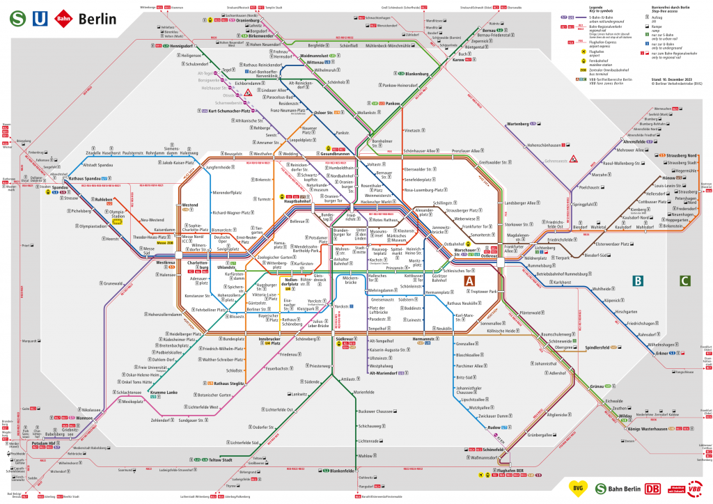
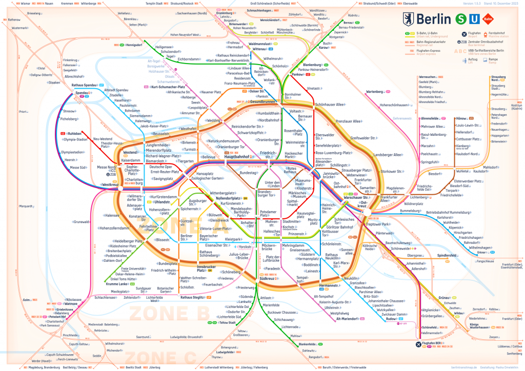
Public transport map of Berlin 2023 by Berliner Verkehrsbetriebe (left) and berlintransitmap.de (right).
In the One World Metro book he explains some additional principles and schematics of creating public transport maps such as locating stations in a systematic way while still representing their real location or applying different bendings to lines to better meet reality while arranging stations in the flow of lines at the same time. A wonderful example is https://berlintransitmap.de, which compares a new public transport map with the current “robot-like” and many historic maps. The website explains the simplicity of the new style and why it might be better to understand. Check it out to make your own opinion about the need of spatial accuracy!
It seems that schematizing a plan can lead to overdoing it which can result in public transport maps getting too abstract. It is worth to bring back reality without neglecting abstraction. As always, it is worth to keep in mind more than only one goal.
If you want to have even less accuracy for broader overview, then have a look at Zhaoxu Sui’s “Earth Transit”, a map showing major world passenger rails: https://zhaoxusui.github.io/2022/05/22/World_Passenger_Rails/ Wouldn’t it be great to travel the world as easy as using urban public transport?
First of all, I have to admit that I’m quite a „map junkie“! Years ago, already as a boy, I always had a map of the German railroad system being attached to my room’s wall, side by side with the current „Star-Schnitt“ (= poster of famous people frequently included in the youth magazine „Bravo“, back in those days). These railroad system maps were part of the twice annually published printed railroad timetable. And up to now, one of the first things I do when visiting a new region is buying a map. You might image that today there are quite a few of them sitting in my book shelf!
Studying the – in most cases topographical – maps with a lot of accurately positioned information on them helps me to create a good understanding of where towns, rivers, lakes, mountains etc. are located adjacent to each other, and how they are connected through roads, railway tracks etc.. This “world map” in my head enables me to navigate around quite well, even without the use of a navigational device. My children, on the other hand, grew up with today’s navis, and they therefore had no need to ever look onto maps in more detail for navigational purposes. The resulting lack of topographical knowledge or orientation let them get lost in many cases without the support of such a device, when traveling from A to B.
You mention in your very interesting post, “…Mapping the world not always means to map it accurately…“ From my point of view, this is absolutely true, as the necessary accuracy as well as the species of information to be included mainly depends on the map’s purpose. For the above discussed navigational purpose, a lot of detailed features and their accurate positional representation is a must. For a map of a public transportation system the positional accuracy of where the lines exactly run or the stations are precisely located, might not be so important. Nevertheless, to support a traveler in deciding which station will be appropriate the most appropriate to enter or to leave the system, the map should at least roughly represent the topography of the town. Including rivers, canals or selected famous buildings can definitely help, additionally.
And other information than topographical details on the map are important on a transit system map. The more complex a transportation system is, the more important might be, where one can switch between different lines and what types of transportation (local train, subway, bus, street car etc.) are available, for example. The Berlin Transit Map mentioned in your post, is an excellent example for a highly sophisticated and up-to-date map, that does include (almost, see below) all information a traveler needs to have to efficiently and successfully use the system, in my understanding. And I’m writing this as someone who has lived in Berlin for more than 50 years.
I would like to concentrate on one issue to explain my assessment of the Berlin Transit Map : transfer stations. Let’s take a closer look onto the station “Potsdamer Platz”, right in the center of Berlin. This is a pretty complex station, where you can switch between local trains, several S-Bahn lines as well as a subway line. Besides this topological possible transfer information the Berlin Transit Map also includes the correct topographical information about the different lines running through “Potsdamer Platz”. The S-Bahn lines run north to south – or vice versa – through the station, in parallel to the local train lines, and the local trains are running west of the S-Bahn. This is perfectly represented in the map, both topological as well as topographical.
The subway is crossing, west to east – or vice versa. This crossing is correct in terms of the topological information. In terms of the topographical information it’s more of a south west to north east crossing in reality, or the other way around. But this is not so important. The more important information can be extracted from the way, the station is represented on the map. It is represented more like two separate but very close-by stations, with the subway station being located east of the combined train and S-Bahn station. And this exactly matches the situation in reality! If a traveler wants to transfer from the S-Bahn to the subway, she/he has to exit the underground S-Bahn station, cross a road and then enter the underground subway station. This means some walking is included, leading to a certain amount of time for the transfer to be taken into account. All this information can be extracted from the more or less schematic map! And the described overlay of correct topological with very accurate relevant topographical information is similar for the whole Berlin Transit Map!
Nevertheless, I have found two information that are missing on the map. First of all, the Berlin public transportation company BVG is also operating several ferry boat lines, that are not represented on the map. For example, the ferry line F10 is crossing the lake Wannsee between the S-Bahn station “Wannsee” and Alt-Kladow at daylight on an hourly schedule. If you want to go to Alt-Kladow, taking the ferry boat definitely is a much less time consuming option compared to going the long way around by S-Bahn and bus.
And – under the current frequent strike conditions – it would additionally be interesting to have information included on the map, who is actually operating the S-Bahn, the local trains, the subways, the busses etc. This information could help a lot in making travel plans, as the S-Bahn and the local trains are operated by the Deutsche Bahn, whilst subways, busses, street cars and ferry boats are operated by the BVG company. And therefore, if there is a strike at the Deutsche Bahn, for instance, only the S-Bahn network as well as the local train system is affected, while there are still other options available to travel around in the city of Berlin.
I’m not quite sure if it will be easy to incorporate also the labor unions, which are active in the transportation companies. The S-Bahn, for example, has to handle two of them at the same time. If one is on strike it does not mean that everything grinds to a halt…
By the way: If you deal with accuracy of public transport maps you continue to find fascinating projects. One of them is the “Station and transfers” by Albert Guillaumes Marcer: http://stations.albertguillaumes.cat
Here he creates 3D visualization of public transport stations with different lines at different levels and different angles with different intermediate levels all sorted by station categories!
Check out Munich Marienplatz with two levels of the same S-Bahn line or Paris Châtelet – Les Halles covering five lines by connecting one station after another. A pleasure to dig deep into public transport underground of familiar as well as unknown stations!
The “Stations and transfers” project by Albert Guillaumes Marcer is absolutely overwhelming! In German, I would describe it as “Der Hammer”! This guy must have traveled almost everywhere, collecting and noting precise information about all these complex stations. Checking his information prior to travelling a public transportation network system definetly helps a lot to prevent loosing time in finding the right platform or getting lost somewhere. I have just one comlaint: by checking many of the Berlin stations, which I know best, I was wondering why most of them do not have the same orientation (= the northern direction differs from station to station)? From my point of view, it would be even more easier to interpret, if the northern direction would always by towards the top, like it is common for maps.